
Color is one of the most impactful and versatile tools in design. It can set the tone, create emotion, and define a brand. In recent years, mint green has emerged as a popular color choice in color palettes. In this article, we will analyze the versatility of mint green in color palette design and explore its many applications.
What is Mint Green?
Mint green is a light, bright shade of green with a slight blue tint. It got its name from the mint plant, which is an herb that has a distinct green color. It can also be referred to as pastel green or pale green.
The Psychology of Mint Green
The psychology of color suggests that mint green is associated with feelings of freshness, calmness, and positivity. It is often used to convey a sense of youth, growth, and renewal. Additionally, it is also considered to be a gender-neutral color, making it a popular choice for brands trying to appeal to a wide demographic.
Complementary Colors for Mint Green
When choosing a complementary color to pair with mint green, it is important to consider the emotions and tone you want to convey. Mint green pairs well with other cool, pastel colors like pink, lavender, and light blue for a romantic or elegant feel. For a more modern or bold look, try pairing mint green with metallics like gold or silver.
Applications of Mint Green in Color Palette Design
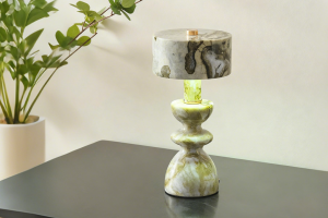
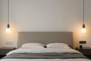
Home Decor
Mint green is a popular color choice in home decor, especially for bedrooms and bathrooms. Its calming effect makes it a great choice for a relaxing sanctuary, while the lightness of the color keeps the space feeling airy and open.
Fashion and Beauty
Mint green has become a fashion trend in recent years, making appearances in everything from clothing to accessories. It is a popular choice for spring and summer fashion, as it pairs well with lighter and brighter colors. It has also been used in beauty products, such as nail polish and eyeshadow.
Branding and Marketing
Mint green has become a popular choice for branding, especially for companies targeting a younger demographic or those in the health and wellness industry. It communicates feelings of freshness, renewal, and growth, which are all desirable qualities to associate with a brand.
Tips for Using Mint Green in Your Color Palette
Use Mint Green as an Accent Color
Using mint green as an accent color can breathe new life into a color palette without it becoming overwhelming. Pair it with neutral colors like white, beige or gray, to balance out the brightness of the color and create a calming effect.
Layer with Multiple Shades of Mint Green
Layering different shades of mint green can create depth and complexity in a color palette. Try pairing a light shade with a darker shade or use mint green as a gradient, fading from light to dark.
Pair with Contrasting Colors
Contrasting colors like black, white or red can add a pop of excitement to a mint green color palette. The coolness of mint green can balance out the boldness of these colors, creating a visually striking result.
Mint green is a versatile color choice that can be used in many different applications to convey many different emotions. Its light and airy quality make it a popular choice in home decor and fashion. It also communicates feelings of freshness and growth, making it a desirable branding tool. By using these tips and discovering new combinations of colors, designers can continue to explore the versatility of mint green in color palette design.
More Stories
Cozy Interiors: Fabric Wall Sconce Lighting
Modern Ceiling Lighting: Glass Pendant Light Fixture
Enhance Your Space with a Modern Living Room Cylinder Pendant Light